Graphics have an awesome ability to focus attention and the potential to really nail a message. Since more than 60% of social media is comprised of images, it makes sense that good graphics are essential to branding yourself online. There are many pros to graphics, such as freedom for creativity, ease of sharing, and powerful message conveyance, but there is also the issue of competition– it isn’t enough that you simply post a pretty picture. You have to post a pretty picture AND make sure you use it in the best possible way to convey your message.
Before you start posting, there are 3 initial questions you should ask:
1. What are you trying to say? Are you a brand who wants their logo to appear in the picture to spread your name? Are you trying to promote your new bakery by having customers post a picture with their favorite cake? Figure out what you want to achieve with your graphics, and take if from there.
2. Who are you trying to reach? Are you trying to reach a group of academic professionals? Or is your target the millennials who (excluding those anti-social weirdos) are all versed in the newest visual apps and probably want more image and less text? Figure out who your target is, because while a portrait of mathematician/philosopher ReneeDescartes might impress the first group, the second group would almost certainly prefer a snapchat-style pic of a celebrity.
3. How will you be different? You are one of a million brands on Facebook. It is up to you be one in a million. Think about how you will stand out: will you post specific graphics, use special icons, or do you have a unique mode for sharing content? In short, know how you will stand out.
 Once you have answered those questions, it is time to pull out your bag of graphic tricks:
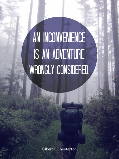
A. Use Grids and frames It is rumored that in the “olden days”, pictures that people wanted to stand out were placed in frames and hung in a prominent place on a physical wall (not a ‘board’). Well, the same rule applies online. You have a (hopefully) large audience and a border will make your picture look not only more ordered, but also more professional.
B. Apply Photo Filter Filters are an awesome way to add consistency (and a dab of individuality) to your posts. Besides being just an artistic touch to a photo, a filter can be a fantastic addition to your background. A faded picture behind text is a great way to express your individuality, and make your message stand out more. A really easy (and effective) Facebook post is a quote in front of a picture. It grabs the eye, makes a statement, and is easy to share.
C. Show Your Brand There is no need to get complicated with your brand or company. A simple logo or consistent icon will get the job done well. For example, Etihad Airways posts high quality vacation pictures every week from its different geographical locations, with its title in the upper-right hand corner. Simple, yet very eye-catching (who wouldn’t want a stunning picture of a dream vacation spot?). Consider mixing your icons, colors, frames, texts, and logos to create different templates to display your brand.
D. Be Consistent Creativity is the door for visuals, but consistency is the key. You could try using consistent colors, like the brand CLAE. They have used the same blue background for their recent posts, which makes their posts recognizable in the News Feed. If not color, you can try using consistent images, such as different people wearing your company’s shirt in multiple locations, the same cartoon characters for different messages, or the same background image but in different colors, to name a few. Images grab attention, and consistency builds recognition. Combine the two, and you will achieve visual branding.
In conclusion, mixing and matching your graphics will give you engaging posts, while the tips above will help you build consistency and professional recognition. Have fun being creative, and enjoy watching your graphics create engagement for you.
For more information, check out Kimgarst.com.