22 years ago, Starbucks released its first seasonal to-go cup, launching a tradition that would continue in notoriety – and sometimes even infamy. Who could forget the red cup controversy? A little bit of cardboard and ink can go a long way, it appears. But all-in-all, you have to hand it to Starbucks for generating freakish hype simply from the annual release of a disposable cardboard beverage vessel.
This year Starbucks released not one, but four designs, and also held a promotional social media campaign with a giveaway of a limited-edition reusable seasonal to-go cup. In a partnership with Alaska Airlines, customers who had the special Starbucks cup were given priority seating, and also received Starbucks treats on their flight.
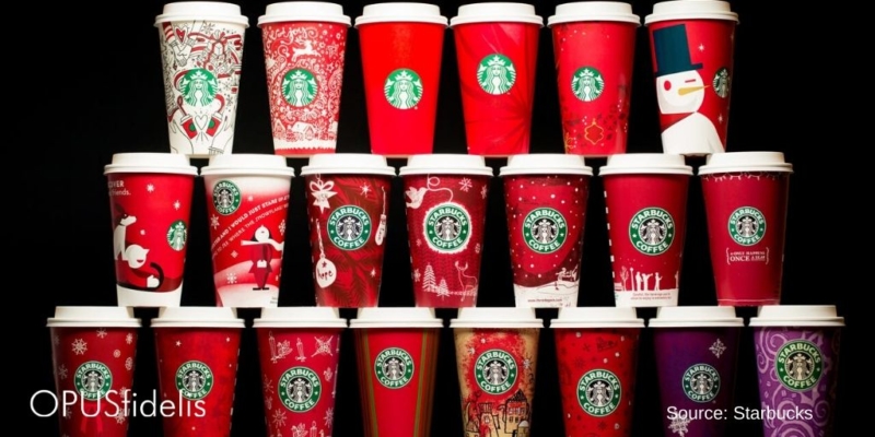
But Starbucks also gave us another gift – le pièce de résistance – a press release highlighting every cup from the last 22 years. We decided not to torture you with all of the designs here. But we have taken the time to present the good, the bad, and the ugly highlights of Starbucks’ seasonal cups.
The Good
2003 – Oh Starbucks, why did you forsake subtlety in your cup designs? Magical stars a-twinkle, and subdued shadows of dancers with cups make this design simply enchanting.

2004 – It’s a present! It’s snowing! So balanced, so classic – and great from every angle.

2016 – Granted, having multiple designs in one year greatly increases the likelihood that at least some of them will be well-liked – but this design from 2016 looks like a scrumptious cookie.

2006 – Simple, yet intricate – a lasercut study in red and white.

The Bad
1999 – This design was going fine until we saw the bottom. Is that a car or a flying saucer?? Who knows.

2001 – While it is supposed to look like a present, it really just looks like a mistake.

2019 – This one is not exactly fair since there are four designs this year. Overall, this dabbling in lexicography is strangely reminiscent of Doctor Seuss in aesthetic – and in nonsensicality. Merry coffee? Seriously?

2017 – We ordered coffee, not an acid trip. This assault on the eyes was just a little over the top.

2000 – Nothing says Christmas like poorly drawn houses that are sprouting spouts and handles. To top it all off, the cactus planets and a blotchy color scheme really enhance the overall effect. Did the CEO’s son throw a tantrum demanding his drawing be featured on the seasonal cup? We’ll never know. Maybe we should cut the designers some slack. It was 2000 – people were freaked out about Y2k and weren’t in their right minds, right?

The Ugly
2015 – This one gets its own prize : Most controversial cup of all time.

All images sourced from Starbucks.