The best color for call-to-action buttons? It’s a tricky topic, since every article or piece of research on it yields different data. And in most of these posts, the conclusion boils down to: ‘In the end, you’ve got to figure out what works best for your marketing scheme.’
However, Instagram doesn’t seem to think so.
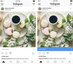
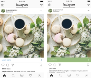
In their latest update, Instagram has redesigned the call-to-action bar on the bottom of their clickable ads to dynamically mirror the images.
Up until now, the bar has always been a bright blue color, which is not surprising, considering that some of the most successful media marketers in the world (i.e. Facebook, Twitter, LinkedIn, etc.) all use a bold blue hue as their main theme. However, Instagram is breaking away from this theme and trying something new.
Now, instead of blue, the bar will dynamically change to the main color contained in the ad’s photo or video, the company announced on Monday. Instagram will change the color of the call-to-action bar to better coordinate with the primary element of the native ad that grabbed the user’s attention.
The site then demos the look:


When asked about breaking away from the mold, one Instagram spokesperson replied that:
…the redesigned look is meant to ensure that an ad’s photo or video is its standout element and to make people’s feeds feel more natural. It may also ensure that Instagram can insert more ads into those feeds without making them look overloaded with ads.
Although there has been very little data as of yet, it looks as though Instagram is trying to seriously raise the clicks, like and comments on their featured ads.
Bright, bold colors may grab your audience’s eye, but it might be time to try a ‘less is more’ approach to call-to-action buttons. Don’t shake it until you try it! We’re looking forward to keeping an eye on the results.


