
Facebook has released a new design for business pages which provides a more user-friendly experience by making the call-to-action buttons more prominent, as well as adding other improvements.
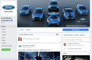 The driving idea behind the new business pages is to make you feel more like you are on a website homepage. To simulate this effect, Facebook has done things like giving businesses a larger cover photo and removing the ads that would normally appear on the right-hand side of the page in desktop mode. The social network has also moved the profile picture over to the left-hand side so it will not block to center of the cover photo, as would occur on a normal Facebook page.
Facebook has also redesigned the way users navigate business pages, removing tabs and adding a bar on the left-hand side of the page that allows you to access the various sections of the page the way you would on a website. These changes come in light of the overwhelming shift of Facebook users’ preference from desktop to mobile.
By giving business pages a cleaner, more sleek look, Facebook hopes to entice more people to shop on the actual site. In addition, Facebook’s removal of desktop ads on business pages marks its evolution from mere social network to internet giant. The company no longer relies solely on advertising to make money, but now on a number of factors extending well beyond the scope of social networking.
Overall, Facebook’s shift to a more mobile-oriented environment shows that all businesses with an online presence need to adapt to mobile, or get left behind.