
Both Google+ and Facebook announced some pretty drastic changes to the look and feel of their story presentation this week. As the two largest social media networks square off in their bid for heavy weight champion, what benefits can we expect as users?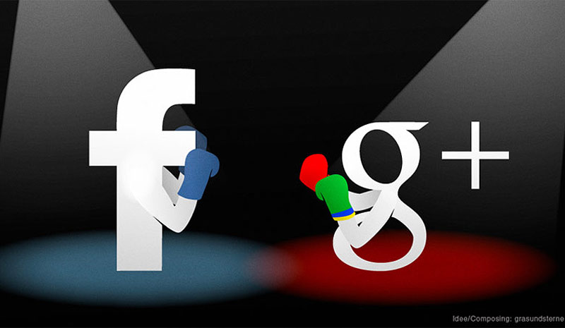
Facebook unveiled its new Newsfeed design on Thursday, but Google+ beat them to the punch with a pretty drastic redesign of their own. So let’s break down what’s new on the two social media platforms, starting with Google+.
The main change for Google+ was the EPIC cover photo redesign. The cover photo now takes up nearly the entire page with a massive 2120 pixels by 1192 pixels image. For those playing along at home, that’s almost double the pixels of your HD TV. But we’ll do you one better: the photos can also be turned into animated gifs. Google+ isn’t just competing with Facebook anymore. They are rivaling Tumblr and Pinterest in the new and exciting ways images work with your Google+ profile. For a full breakdown of the Google+ changes, click here. The redesign is beautiful. Everything looks very clean.
As for Facebook, it seems like they are more focused on giving the user options on how their Newsfeed is presented to them. Basically, Facebook users will now have the option to select from different Newsfeeds on different information. For people who have 1,000+ friends on Facebook, this is a lifesaver. For people who have only a few friends, it probably wont really affect them. For a breakdown of the full update, click here.
We think it is a bit odd that both platforms significantly updated the way they display visuals, and that Google+ rolled out their changes just before Facebook. Facebook might want to look into their mole problem. That or just stop making dramatic announcments a week in advance every time they do something.